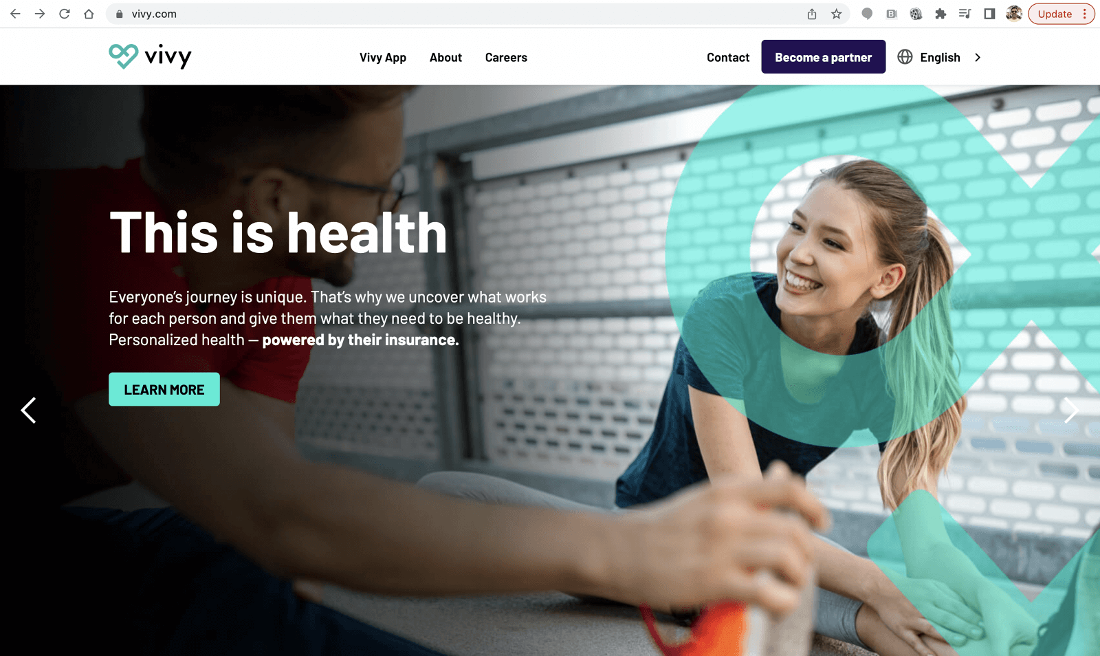
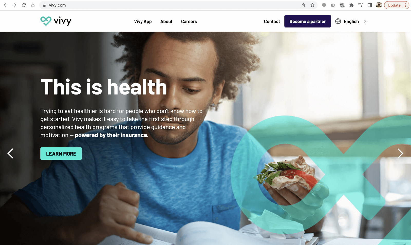
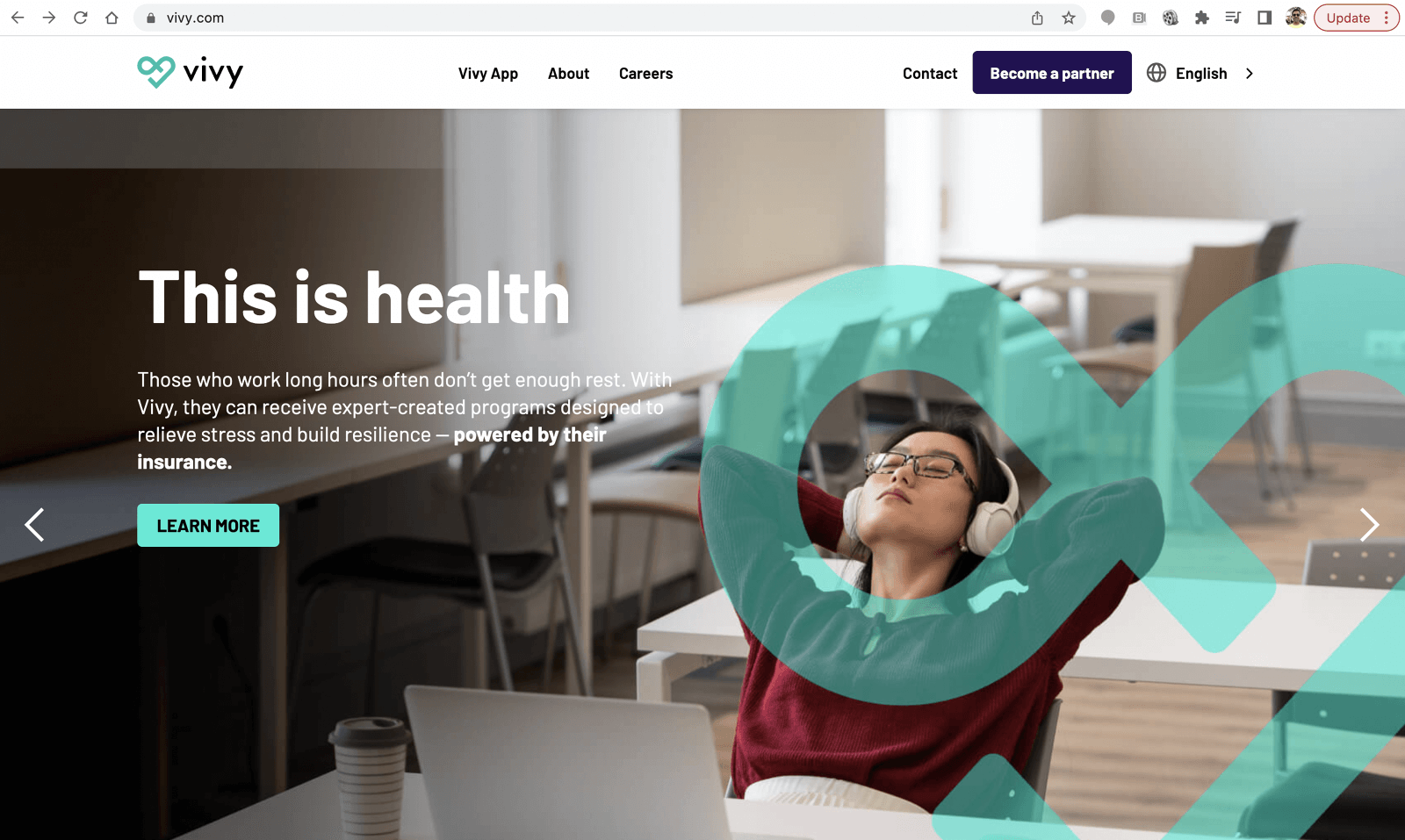
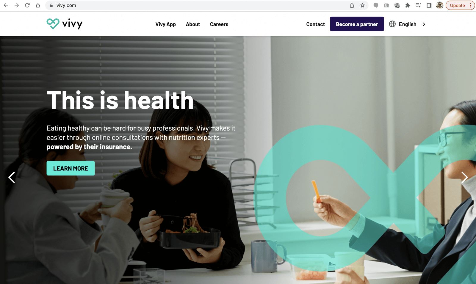
This is Health
VIVY
The Sunny Side did a brand relaunch for German health tech firm Vivy. This included an integrated campaign and a new design style for the app and website.


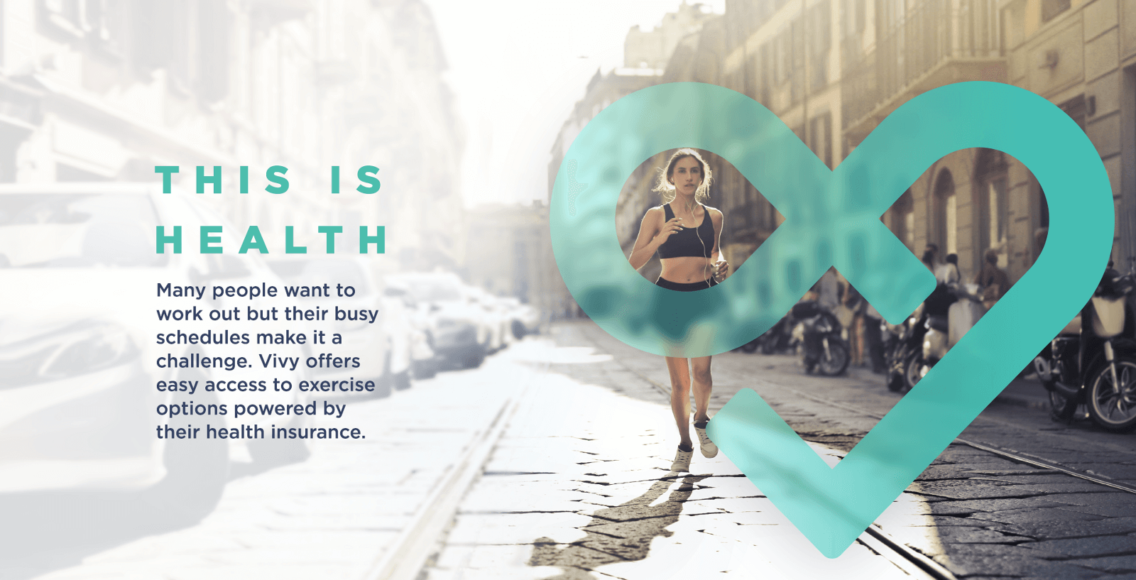
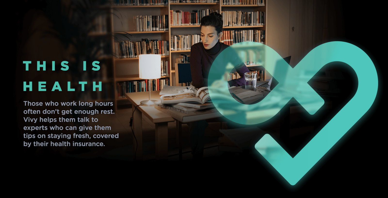
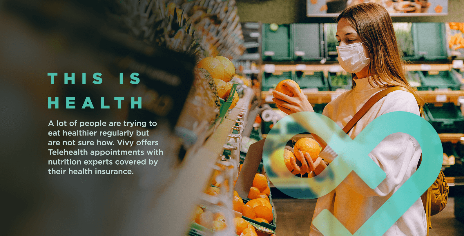
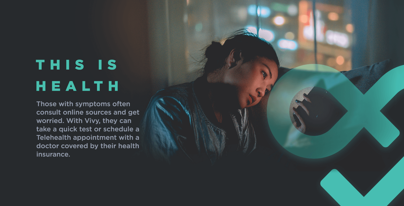
Following that, for the integrated campaign, we conceived the big idea of “This is Health” which is about spotlighting real, relatable, gritty moments of people taking care of their health. It’s meant as an antidote to the synthetic imagery like “people laughing as they eat a salad” we often see in healthcare communications. We designed the below key visuals.

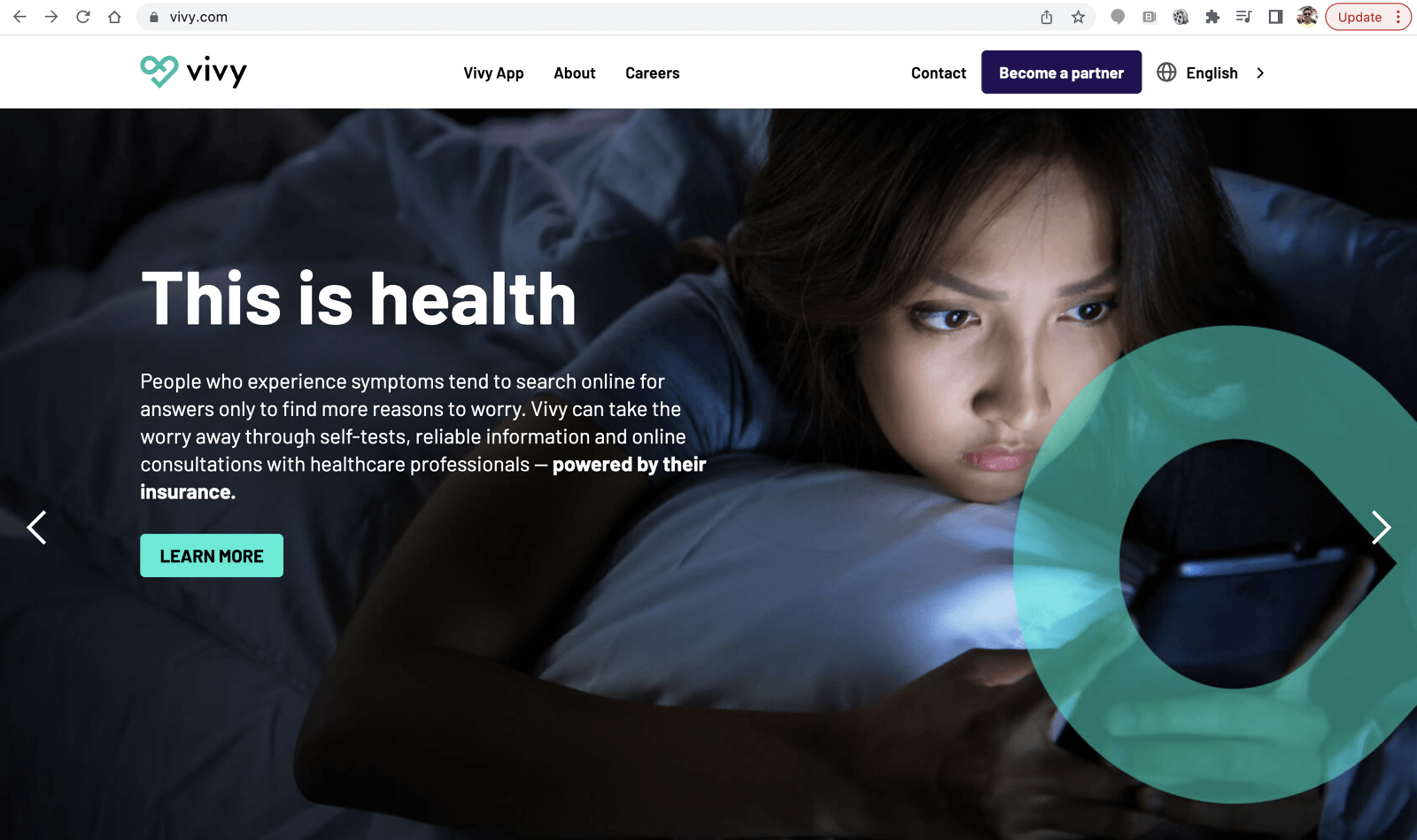
Finally, we designed the below pages for the new Vivy website, which was then used as a guide by Vivy’s in-house design team to redesign the rest of the website. We retained the colors and shapes of the app design but made it more vibrant with use of purple (a secondary brand color)


Below are screenshots of the final website that leveraged our big idea of “This is health” and variations of the key visuals we designed.